Effective Data Visualization with R
(0)Students use an online interactive Shiny app to generate visual displays to answer multiple research questions for two case studies
Prerequisite Knowledge
- Interpret scatter plots, line plots, bar plots, and histograms
- Familiarity with the R programming language, and specifically with the dplyR and ggplot2 packages. You should be familiar with:
- The pipe %>% and the mutate, filter, group_by, summarise, top_n, arrange, and different join functions
- What aesthetics, geometries, and scales are in ggplot2, and how to add new layers to a ggplot object
Learning Objectives
- Given a dataset and a question, select an appropriate plot type (scatter plot, line plot, bar plot or histogram) and use R to create a visualization that best answers the question
- Given a visualization and a question, evaluate the effectiveness of the visualization and suggest improvements to better answer the question
- Interpret the visualization in the context of the research question
- Referring to the visualization, communicate the conclusions in nontechnical terms
- Use the ggplot2 library in R to create and refine the above visualizations
Description
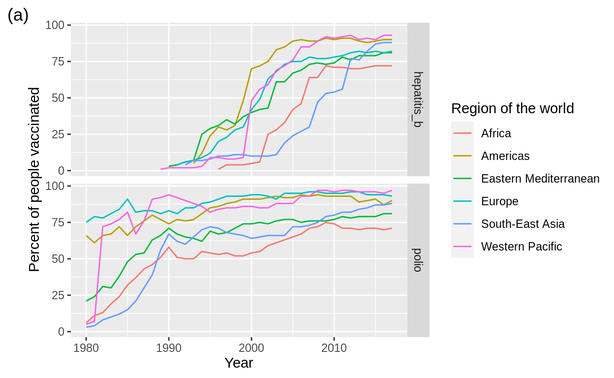
The goal of this activity is for the students to expand their data visualization knowledge and toolset to create visualizations that use data to answer specific questions. They will learn effective ways to visualize data, as well as some general rules of thumb to follow when creating visualizations. All visualization tasks in this tutorial will be applied to two datasets, one of vaccination data from the World Health Organization, the other of fast-food restaurants in the western United States. Throughout the activity, students will have to think critically about what type of plots are best suited to answer the research questions. They will then write down R code to generate those plots in ggplot2, and be prompted to critique and improve them. Quiz questions are automatically checked for correctness. This activity is modified from the Data Science 100 course material, as developed in the Statistics Department of the University of British Columbia.
Suggested Uses, Tips and Discoveries
This activity can be used to expand students’ ability to use R to create data visualizations, as well as to develop critical thinking abilities in a data visualization context.
The activity is appropriate for all class sizes and can be completed individually, although some questions benefit from group discussion. Ideally, these discussions would take place with groups of around 4 people either in the classroom or lab. It can also be assigned to students to complete outside of class, either as a take-home assignment or, if split into parts, as a pre-class activity. The activity takes around one and a half hours, but it can be naturally split into two shorter activities (Part 1: world vaccination and Part 2: fast food).
The resource can be accessed online at https://shiny-apps.stat.ubc.ca/FlexibleLearning/Effective-Data-Viz/. Instructors can also download the Rmd and auxiliary files used to generate the activity. In order to run the file in your computer:
- Open the RProj
- Open the Rmd file
- Install any needed packages (R automatically detects which ones are needed)
- Click Run Document and the Shiny app will be generated
Creator
- Di-Luvi, Gian Carlo
- Timbers, Tiffany
- Campbell, Trevor
- Gill, Harmeet
- Flores Siaca, Ian
- Lee, Melissa
- Isberg, Sonja
Resource Type
Related Resource
Date Approved
Access
Everyone

https://statspace.elearning.ubc.ca/handle/123456789/332
Comments
Ratings in detail